Saturday, October 29, 2011

Beauty and the Beast

 Another of Disney's production.  I find it easy and good to use Disney's movie as an example for colour theories.  As you might notice in Lion King, they tend to have a lot of colourful animation.  And this next one is Beauty and the Beast. 


If you can still remembe at the beginning of the movie, Belle (the girl in the blue dress) is singing outside her house and around the town as well.  After watching it the second time, I noticed that she is the only one who wears blue in this town.  The rest of the residents are wearing pale orange, pale brown, pale red or pale green.  I think this is to help children so that their attention won't dawdle into another place.  


If you can also recall, There's a scene where the house servants are preparing the dinner for Belle.  They throw her an amazing entertainment too.  Songs, dances and beautiful, highly saturated colour everywhere.  I believe they have this kind of scene in a lot of their movies.  To make everything more lively. 

Anthony Van Dyck

Sir Anthony Van Dyck was a Flemish Baroque artist who became the leading court painter in England.  He was born in March 22nd 1599 and died in December 9th 1641  He is most famous for his portraits of King Charles I of England and Scotland and his family and court.  But in these paintings that I'm going to talked about are not the paintings of King Charles and his family. 

 (Saint Ambrose and Emperor Theodosius)

(Virgin and Child with Saint Anthony of Padua)

The above paintings here, has a lot of objects in it.  But when our eyes first look at it, we fixated our eyes on a certain objects or colours.  The first painting is kind of leading to the middle.  We can see that everybody else in the paintings are looking to the middle and the painter (Anthony) is also giving a more saturated colour to the two people standing in the middle rather than giving a brighter colour to the rest.  Therefore the main focus are the two people arguing in the middle.  The same thing can be said for the second painting.  With such a darker and more natural colour on the background, our gaze immediately focus on the virgin holding the child.  And if we look carefully, there seems to be a yellowish glow near the head of the virgin and the child.

Lion King

This week, I'm going to look at the color proportion in the Disney's Lion King.  I've watched this movie in DVD long time ago, when I was still in my childhood days.  I can't really remember what's the story about and the great songs in it.  But luckily for me, the movie was shown again in Odeon in these past few days.  Since I've been enrolling in cinematography class and colour class too, watching a movie nowadays is not the same as before.  I started to pay attention to the light, the cut, the edit, the colour, the composition.  It might be good for me to understand cinematography but it's a bit hard to get absorbed in the movies now.  Anyway, I've seen some scenes in Lion King that's worth talking about in here.


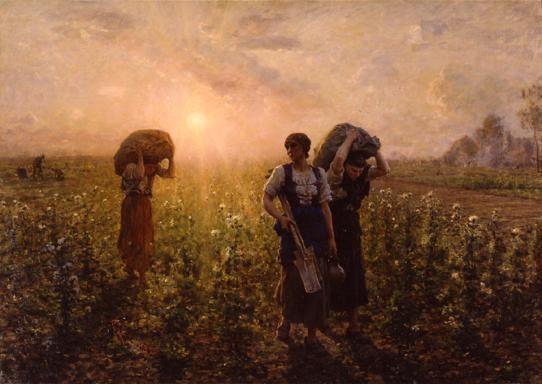
In the first few seconds or minutes of the opening of the movie, we're shown with a great scene of the sun rising.  At the moment, the environment is covered in red.  And as the sun rising, it burns brightly yellow  to the environment.   Because of the environment is covered in dark red, the focus of the eye suddenly goes to bright sun peeking in.  And as the sun rise higher and gets bigger in the screen, the color of the environment is changing to a brighter orange.  And thus we have a nice transition of color proportion.


In these scenes, they are both a bit dark and a bit dull.  But you can notice that the look and feel of the forest or savannah is natural.  In the first picture, the lone tree in it has a brighter green compare to the grass in the foreground and the background.  And there's also a hint of yellow on the ground.  Even though the yellow is bright, because the size of the color is not that big, it still fits to the colour proportion nicely.


On these next scenes; it's where Simba is trying to ran away from Zazu, they all started to sing in the middle of the jungle, and the colour of the jungle suddenly changes from a dull boring but natural colour into a bright highly saturated colour.  And it's a really bouncing colour.  For example, to put green with red together and then blue and yellow and many more.  It gives a dynamic, bright, happy and powerful feel to the atmosphere.


Saturday, October 22, 2011

A Christmas Carol

A few months back, I bought a disney movie called A Christmas Carol.  I was looking for a good 3D movie and this is one of the 3D movies that I like to watch again.  Still talking in a saturation and color value subjects, this movie actually has a good examples about those subjects.


If you could remember, in the beginning of the movie, when Scrooge's partner has just passed away, the color in that particular scene and on forward is duller and more desaturated.  It's a pretty sad and grey in the beginning of the movie.  But then, the color is getting brighter when the ghost of the past shows Scrooge of his past when he met a beautiful girl; she became his lover for a while, in a dance festival.


And then, it's back again to a more gray atmosphere.  This keeps on going for a few times.  Whenever there is a happy memories, the color will get a bit brighter.  Another example is when the ghost of christmas present make his appearance.


He sits so high above a mountain of presents.  The room is also brightly lit and decorated.  It gives a richer and merrier christmas.  And then again, the color beginning to diminished near the end of the ghost of the christmas present departure.  It keeps on getting darker, and duller when the ghost of christmas future or death visits Scrooge.  But in the end, it all went a lot better for Scrooge and his clerk and his clerk's son.  Scrooge started to enjoy christmas like everybody else and he become like a second father to his clerk's son, tiny Tim.


Making the movie in this way; from a dull color into a brighter and more saturated color at the end of the movie, helps the audience to enjoy it better.  To me it feels like it enhances the mood or atmosphere better when they (the cinematographer) pay a lot of attention to the lighting and color, like in this film.

Lord of the Rings: War in the North

In this entry, I'm still going to look at the saturation and the color value of Lord of the Rings: War in the North.  This title is going to be released in November 1 as a game in many platforms.  Being a huge fan of Lord of the Rings, I've been waiting for this game for a long time now.  I even followed their facebook page to look for some news regarding the game or special offers.  A couple of days ago, I was clicking through the photographs when I found several great concept arts on their facebook page. 


All of these pictures have a really great atmosphere.  Looking at the first picture, we could see that there are a lot of fires burning strongly in several places in the ground. This gives a more gray and red reflection to the surrounding environments.  The red is obviously coming from the fire, and the grey is from the smoke.  That's why, the ground, and some neraby walls and environment near the fire has a red saturation on it.  While on the higher places, grey is more dominating.  The same thing can be said with the other 3 pictures.  I personally like the last image; feels like in a Mirkwood Forset, it has a mysterious and calm sensation in it.  the shadow in forground suggest that behind us is the darker and deeper forest, while in the background, it looks like a way out of the forest.  And it is possible to achieve this by using a lot of different value and saturation of green.

Thursday, October 20, 2011

Alice in Wonderland

Still talking about saturation of color, I have an example from Alice in Wonderland.  I'm talking about the recent movie that was recently released in the cinema.  It has a lot of good render in the movies.  In some of the scenes, the saturation is really high.  For example, when Alice came back to the Wonderland, and looking at the flowers in the environmenment, you can see how bright and colorful they are.


Then, when you see the scene where they are going to battle it out, you can notice that the sky is getting darker and the color are getting desaturated.


And then, near the end of the battle, to enhance the emotion and to give the audience a bit of hope, the sky started to open up and a bright light shines down.  Even though the color is still desaturated, but with the light, somehow it feels more encouraging.

Paul Gauguin

There's an interesting painting by Paul Gauguin that I would like to talked about.  In the Digital Cinematigraphy class I had with Michaela on 18 October 2011, She talked a bit about one of Paul Gauguin's painting.  This painting is called 'Tahitian Landscape'.  In this painting, He used a lot of highly saturated paints.  I find this painting really eye catching.  Even though at times, a more desaturated paintings look more realistic, this one is more expressive in its own way.


However, when I look for this painting in the internet and on the 'Art' application, it shows me a few more version of this painting.  I'm not really sure which one is the original or if all of them are his paintings.  But here you go:


Michaela showed us the first painting in the class, while I found the second and the third one in the 'Art' application.  The last one is from wikipedia.   Comparing the four of them, I must say that I inclined more towards the first painting.  It seems to outshine all of them (probably because of the high saturation?).  Lastly, I think, the last one looks more realistic.

Wednesday, October 19, 2011

Jules Breton

This time, I'm looking at Jules Breton painting.  I was in a classroom today, researching for the topics of my blog, when I came across his paintings. I found him while i was scrolling inside an application named 'Art' in my iPod, several of his paintings are what I'm going to talk about in here.  I'm sure none of us are able to know all the names of the color that are exists in this world.  I'm also sure that none of us are actually using a lot of them.  These color that I'm talking about are a combination of some colors.  A combination of a complimentary colors are actually quite nice if used in the right circumstances.  For instance, I have a green and a red in here.


Although it looks like a dirty muddy color, but if you take a look at these paintings, you will understand what I mean.  These paintings are done by Jules Breton.  A French realist painter that was born in May 1827 and died in July 1906.


We can see it in here, that there are a lot of desaturation of the color.  There's no more color that are identifiable anymore.  I mean, we can see that it's yellow, or green or red, but what kind of red, what kind of blue or green?  These sort of complimentary colors are necessary to build up the mood and giving a great atmosphere to the paintings.

Thursday, October 13, 2011

Street Sign and Light Indicator

Still in the topic of bright red color, I noticed a rather interesting things.  Whenever we look at street signs that says 'stop' or 'give way', we see a lot of red paint either in the border or as the background.  And some other signs are in green or yellow or blue.  I think, our eyes are getting used to certain color and their meaning.  For example, when we see green, we feel that it's a calm and friendly colour, much like blue.  Where as in yellow and red, we feel more cautious, alert and be aware of our surroundings.

 
And so I believe, using this same concept, they applied this to everywhere.  Like the lights in car, whenever we turn to the left or light, we turn on the side lighting, which is yellow and giving the indication to the people in front or behind of our car that we are going to turn.  The tail lights are also similar with it.  In conclusion, our mind is now programmed to react or think in some way whenever we see a certain color.  Which made me believe that if we wear or use certain color in our lives, it could affect our ways of thinking.  I'll dig deeper into it on my next posts.

Wednesday, October 12, 2011

Rollins Band - Liar

Speaking of the color red on my previous post, I've got an interesting video clip to share with you.  This is the Rollins Band, lead by Henry Rollins (the singer), with a video call 'Liar'.  Martin showed us this video in class for the purpose of lighting, compositing and rendering lesson.


In this video clip, which is directed by Anton Corbijn, the tint of the video is really orange.  It stays orange for most part of the video.  It gives us a cautious feeling about this video.  I feel that we can't relax by watching it.  We need to put on some sort of a guard to prepare ourselves when we watch this.  In the chorus part, Henry was painted bright red all over his body and he screams while singing the song, it's really captures our attention when we see him like that.  Even though in some parts he was blurred and his band in the background is the one in focus.  My eyes keep on jumping between the background (the band who is tinted in blue and the camera focuses on them) and Henry (who is painted in bright red but out of focus).  Well, in conclusion, the orange tint gives us a cautious feeling towards the video, while the red painted Henry really captures our attention.

Red Riding Hood

A few days ago, I watched a movie called The Red Riding Hood.  I was kind of hoping to see a more interesting storyline than the original version.  And to my amazement, the film is indeed have a lot of twist.  Some changes can be guessed, but the ending is shocking.

Anyway, when I was watching the movie, I didn't realize it that the color was so dull and gray.  It is snowing for most part of the movie.  The first few minutes of the movie was quite bright and cheerful, full of flowers and sunlight.  But when the plot started to developed, the color mood started to change into a more dull and less saturated one.


And then, Valerie (the main character) receives a hood from her grandma.  A really bright and saturated red colored hood.  You can't really help it but to focus on it whenever it is visible in the screen.  The appearance of this bright red hood also feels like the danger is about to begin or the plot is now going to get more interesting.


I think, it's quite clever to make all the other color less saturated than the red hood, so that we as the audience are really focusing on the red hood instead of the surroundings.  We know what the surroundings are, but making the color of the hood more saturated is just helpful for us.  Or at least that is what I think.

Monday, October 10, 2011

Puzzle Bobble

The other day, I was just looking for an app in the iTunes store, I accidentally stumbled my way to a game call 'Puzzle Bobble' (made by Taito).  Are you familiar with this game? It use to be on 'SEGA' console or Playstation 1 if I'm not mistaken (nowadays, you can find this game anywhere, in android or even in iPhone).  I remember, I play this game a lot with my little brother when I was areound 10 years old.


The objective of the game is simple, you have to break all of the marbles by shooting them with the same marble color.  The marbles will break when there are 3 or more marbles sitting together in the same color.  Being a kid at that time, I think I was drawned by the beautiful color the marbles have.  They are all shiny, highly saturated and bright colored marbles.  I really find it so appealing.  Perhaps that's why they make games, candies or any product for children with a lot of bright shiny color.