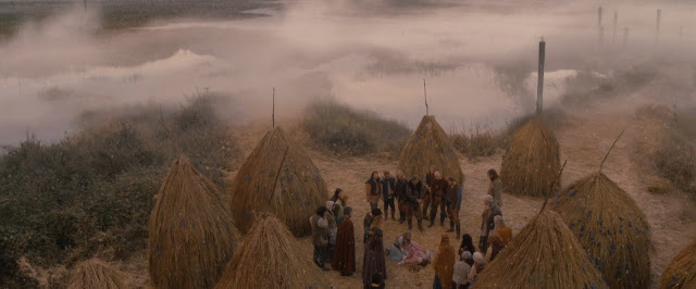
Anyway, when I was watching the movie, I didn't realize it that the color was so dull and gray. It is snowing for most part of the movie. The first few minutes of the movie was quite bright and cheerful, full of flowers and sunlight. But when the plot started to developed, the color mood started to change into a more dull and less saturated one.
And then, Valerie (the main character) receives a hood from her grandma. A really bright and saturated red colored hood. You can't really help it but to focus on it whenever it is visible in the screen. The appearance of this bright red hood also feels like the danger is about to begin or the plot is now going to get more interesting.
I think, it's quite clever to make all the other color less saturated than the red hood, so that we as the audience are really focusing on the red hood instead of the surroundings. We know what the surroundings are, but making the color of the hood more saturated is just helpful for us. Or at least that is what I think.


No comments:
Post a Comment